About
The Hedge Papers
Hedge Clippings
Actions
Press Room
The LLC Files
Rogues Gallery
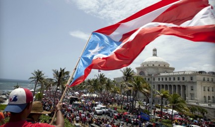
In Solidarity with the UPR Student Movement
We stand in solidarity with the student movement in Puerto Rico in rejecting the massive cuts of $450 million over ...
Read More
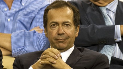
Dan Loeb
A rising member of the Forbes list of “The World’s Billionaires,” Loeb’s net worth is now estimated at $2.5 billion ...
Read More
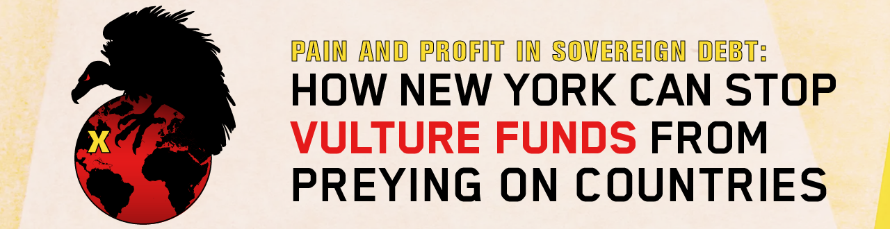
Vultures in Puerto Rico
THEY WANT HUGE PROFITS – AND THEY WILL PUSH AUSTERITY TO SECURE THEM Hedge funds and billionaire hedge fund managers ...
Read More
Recent Posts
2024 Election Data Brief: The Act 22 Donors [Still] Influencing Puerto Rico’s Elections
Spanish Version of the Report October 2024 In a bid to attract wealthy investors, the Puerto Rican government passed ...
Read More
Billionaire-Backed Bigots in the Big Apple
In progressive New York City, it’s easy to think that rampant racism and homophobia in schools is unique to far-away ...
Read More
Pain & Profit: The Act 22 Donors Influencing Puerto Rico’s Elections
Report is available in English and Spanish May 2024 Executive Summary In 2012, the Puerto Rican government adopted Act 22--later ...
Read More
Recent Tweets
Recent Tweets
Next
Page
→